Website design and creation for a business technology company, PSU.
PSU's existing website needed a refresh. Visually, it was dated, and non-responsive to mobile and tablet devices. It was struggling to earn natural high-listings in the major search engines.


Feature rich, compliant & responsive
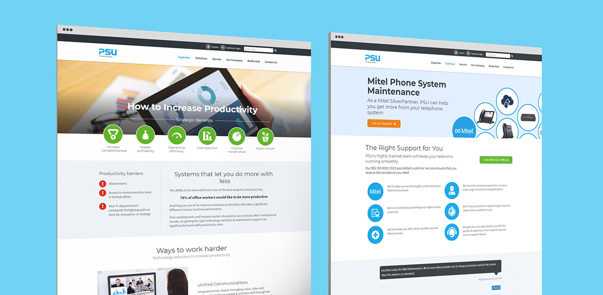
Developed using Umbraco CMS, and built from the ground up, I created a fully compliant, device-responsive website (screenshots above & below), with tools to easily create rich search engine optimised pages and content.

New & fresh
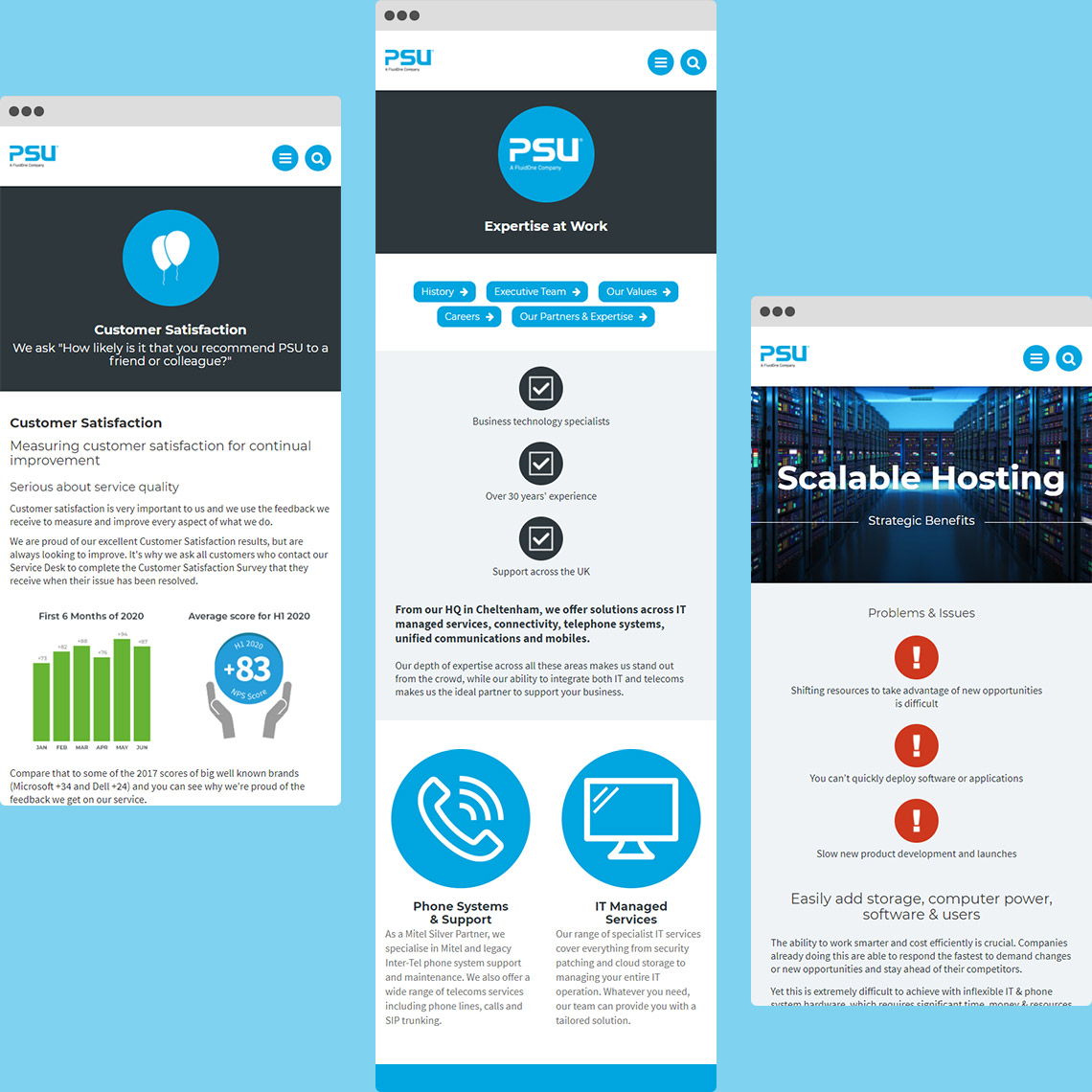
I produced a new, fresh-looking, responsive design (see mobile screenshots below), whilst keeping strictly to branding guidelines. It was a platform that allowed design iterations to be delivered quickly and cascaded across the site, and microsites, easily.
Pages throughout the site ranked well naturally on search engines, which was only further improved once copy was added to pages using the correct headings hierarchy from the back-end CMS. The content was built once and reused repeatedly across the site.
Microdata was present on every page, based on the page type and content - and this assisted in Google showing several pages with featured snippets on their search result pages.

Visually simplistic and easy to digest
In this project, the focus was on design and user experience. Titles, icons and buttons were big and bold. Bands of colour would clearly separate sections from one another. Due to the sheer amount of textual information throughout the website, it was key that it was visually simplistic and easy to read and digest with the help of headings and dividers.
For a website that contained over 300 pages, navigation needed to be clear and concise - and this was achieved through a mega menu that offered the most sought-after pages, based on analytics from the previous website's data. Search functionality also allowed visitors to quickly find the information they were looking for.