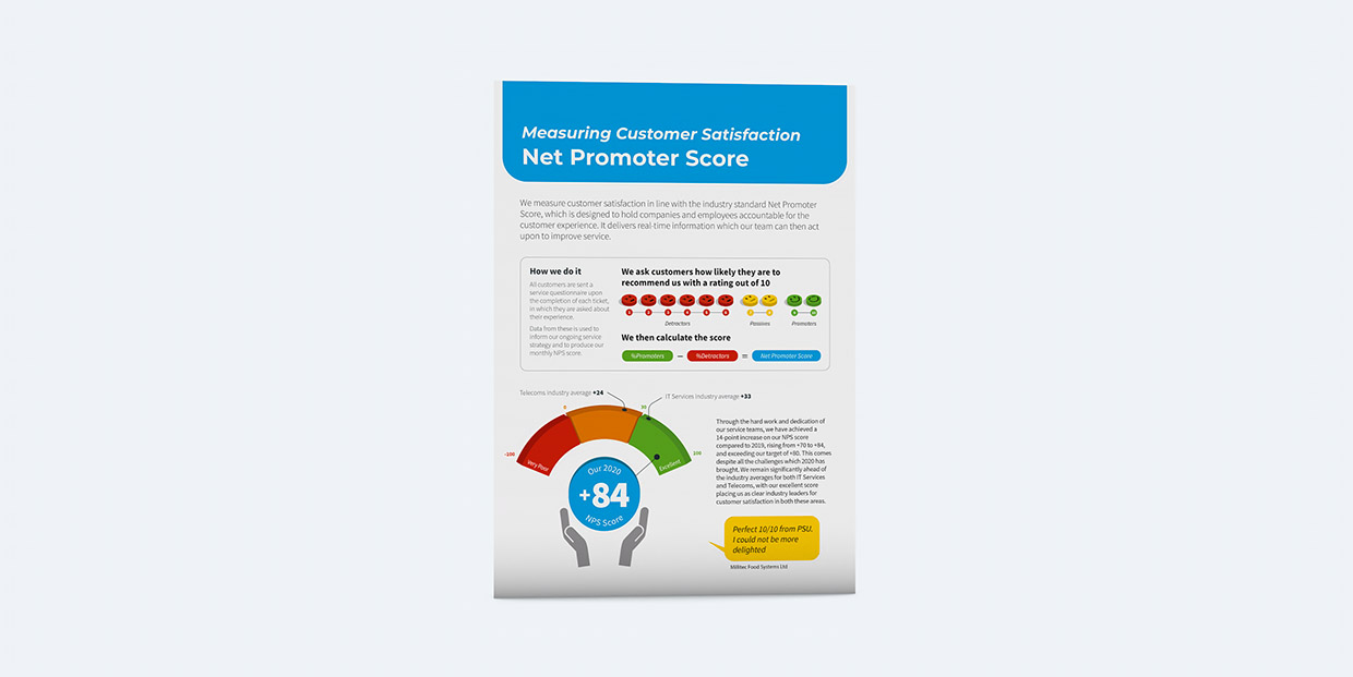
Helping achieve positive NPS response through simple user flow and messaging.
In line with PSU’s strategy based on delivering expertise and high-quality service, it was important to measure customer satisfaction and use this as a promotional tool. When service tickets were marked as closed, customers were sent a feedback survey. However, completion rates were low.
The number of customer feedback surveys completed needed to be increased to allow the company to calculate an accurate Net Promoter Score (NPS) and support their messaging about high-quality service.


Email and survey redesign
I revamped the existing email and feedback survey to be more simplistic and user friendly, promoting the new range of prizes that were on offer as part of a quarterly draw. Using jQuery, each question automatically progressed to the next upon answering, with the option to scroll up and change any previous answer if required.
Certain data, extracted from the email, was automatically labelled on the page in order to reduce the amount of work for the user to complete the survey.
Each question and answer options were on a row of their own, with clear text and positively coloured buttons.

Vastly improved completion rate
The "email to survey" ratio saw a completion rate of 12% - which was an increase of over 60% and customers generally gave consistently high scores for speed, service and ticket resolution, along with great feedback for the Service team.
PSU had an NPS consistently placed very highly within the “excellent” category.

A simplified design proved positive
This was an excellent example of how simplifying design and functionality can make a huge difference to aid a user through a process. Giving the user the absolute least work to do, and making it almost impossible for them to make a mistake will always result in more completions. In this case, I expect the incentive of the prizes played its part too!